Understanding visualization is not just about pretty charts. It’s about turning data into clear, persuasive insights that others can grasp quickly. When we can see patterns, trends, and relationships at a glance, we can make better decisions, tell compelling stories, and collaborate more effectively. Visualization is a bridge between raw numbers and human understanding.
Whether you’re examining a business metric, a public health trend, or a classroom project, learning how visuals work helps you avoid misinterpretation and communicate with confidence. This post explores core ideas, practical uses, benefits, and actionable steps you can take to enhance your own visual storytelling.
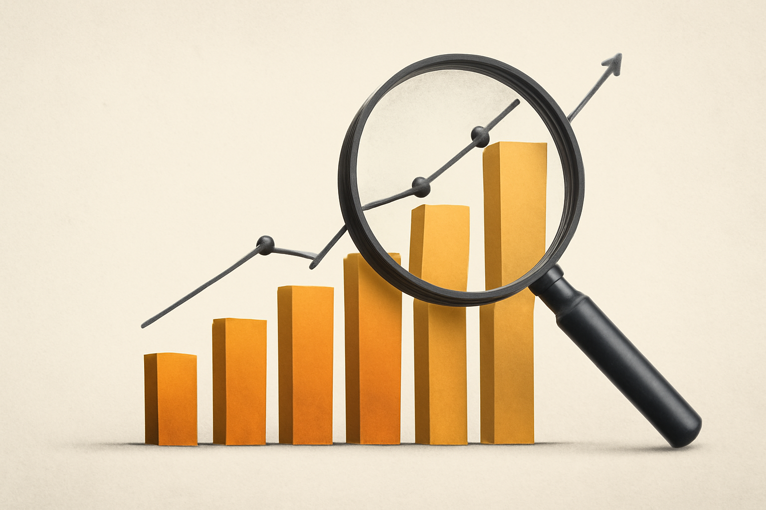
Why Visualization Matters
Humans are pattern-seeking beings. We understand complex information faster when it is presented visually rather than as raw numbers. Visualization distills large data sets into shapes, lines, and colors that the brain can compare, contrast, and remember. A well-crafted chart can reveal outliers, correlations, frequencies, and changes over time in ways text alone cannot.
Good visualization also supports transparency and accountability. It makes data-driven reasoning accessible to audiences with varying backgrounds and skills. When visuals are accurate and honest, they invite scrutiny, conversation, and better decision-making. Interactive visuals—where readers can explore data and test scenarios—empower deeper understanding and collaboration.
Key Concepts You Should Know
- Data-ink ratio and simplicity: aim to show data with minimal non-essential decoration so the message isn’t buried under clutter. Favor clean axes, legible labels, and purposeful annotations. For design guidance, explore Tufte’s principles of visual display.
- Scale and axes: choose appropriate scales (linear, logarithmic, or categorical) and decide whether to start at zero. Misleading axes can distort meaning; clarity often beats novelty.
- Color and accessibility: use color intentionally to encode meaning, not decoration. Prioritize colorblind-friendly palettes and provide alternative text or patterns for those who can’t rely on color alone. See accessibility-focused guidance and examples in FlowingData.
- Chart types and purposes: understand what each visualization communicates best. Bar charts convey comparisons, line charts show trends, scatter plots reveal relationships, heatmaps illustrate density or intensity, and maps expose geographic patterns.
- Distortion and integrity: avoid truncating axes, cherry-picking data, or overloading visuals with misleading embellishments. Ethical visualization preserves honesty and context.
- Narrative and context: a visualization should tell a story with a clear question, the data that answer it, and the caveats readers should consider. Always include labels, legends, sources, and annotations where they help comprehension.
Practical Applications Across Sectors
Business and Finance
In business, visuals summarize performance, forecast revenue, and monitor operational health. A dashboard that combines revenue, costs, and customer metrics helps executives spot bottlenecks and align teams. When done well, visuals support faster strategy shifts and more informed decisions. For a deeper look into how visualization informs reasoning in professional contexts, see FlowingData.
Healthcare and Public Health
Public dashboards track disease spread, vaccination rates, and resource availability. Visuals support timely interventions and clear communication with the public. They also help explain risk factors and outcomes in a way that policymakers and clinicians can act on together. For design thinking in health visuals, consider resources like Census visualizations and related case studies.
Education and Journalism
Educators use visuals to illustrate concepts and compare examples, while journalists rely on visuals to contextualize data stories, counter misinformation, and engage readers. Simple, accurate charts with clear captions enable learners and audiences to inspect claims and form their own conclusions. For storytelling techniques, explore examples from data-focused outlets and data journalism tutorials, such as those highlighted on Tufte’s guidance.
Urban Planning and Environment
Maps, heatmaps, and time-series visuals help planners anticipate growth, manage resources, and assess environmental impacts. Interactive maps let stakeholders explore scenarios, such as traffic flows or air quality, under different policies. External examples of visualization in public sectors can be found through open data portals and visualization showcases like Census visualizations.
Benefits and Considerations
- Benefits: Visuals compress information, reveal patterns quickly, improve memory retention, and support collaborative decision-making. They can democratize data by making insights accessible to non-specialists and enabling cross-disciplinary discussions.
- Considerations: Prioritize accuracy, avoid misleading cues, and be mindful of bias in data, design choices, and audience diversity. Accessibility matters—provide text equivalents, ensure readable color contrasts, and test visuals with people who have different needs. Performance and scalability are also important for dashboards shared across teams or organizations.
- Ethics and governance: document data sources, transformations, and limitations so viewers understand provenance and context. When dealing with sensitive information, apply privacy safeguards and stakeholder consent as needed.
Getting Professional Guidance When Needed
Some visualization projects benefit from professional input, especially when data is complex, high-stakes, or intended for broad or diverse audiences. A skilled data visualization specialist can help with data governance, storytelling, visual design, accessibility, and platform-specific constraints. If you’re building enterprise dashboards, collaborating with a BI professional or a designer who specializes in data storytelling can save time and improve outcomes. For foundational learning, you can reference established design thinking and visualization resources such as FlowingData or Tufte’s principles.
Actionable Steps to Get Started
- Define a clear question. What decision or insight should the visualization support?
- Collect and clean the data. Ensure the dataset is complete enough to answer the question and note any limitations.
- Choose the right visual type. Match the chart to the message you want to convey (e.g., trends, comparisons, distributions, or relationships).
- Draft a simple prototype. Focus on accuracy, legibility, and a straightforward flow from question to insight.
- Prioritize accessibility. Use colorblind-friendly palettes, legible fonts, and descriptive labels. Include alt text for images if publishing online.
- Annotate and contextualize. Add concise explanations, axis labels, data sources, and any caveats readers should know.
- Seek feedback early. Share a draft with colleagues or a sample audience and note points of confusion or misinterpretation.
- Iterate based on feedback. Refine the visuals, reduce clutter, and adjust the narrative to improve clarity.
- Document decisions. Record why a particular chart type was chosen, what the axes represent, and any transformations applied to the data.
- Publish and monitor. After release, observe how readers interact with the visualization and be ready to update or clarify as needed.
Tools, Resources, and Examples
There are many tools suited to different levels of expertise, from spreadsheet-based options to programming and BI platforms. Popular choices include Excel and Google Sheets for quick visualizations, Tableau and Power BI for interactive dashboards, and libraries like Python’s matplotlib and seaborn or R’s ggplot2 for custom visuals. To deepen your skills, explore tutorials and design principles from reputable sources such as Power BI learning resources and practical visualization galleries.
External resources mentioned in this post often provide broader examples and case studies. For design theory and visual rhetoric, consult Edward Tufte’s work, and for data storytelling techniques, visit FlowingData.
Common Pitfalls to Avoid
- Overloading visuals with too many variables, colors, or patterns—simplicity aids comprehension.
- Misleading axes or truncated ranges that exaggerate differences or hide variability.
- Relying on color alone to convey meaning—provide patterns, textures, or labels for clarity.
- Cherry-picking data or omitting important context that would alter interpretation.
- Using 3D effects or decorative elements that obscure data or reduce readability.
As you practice visualization, you’ll notice that the best visuals respect readers’ time, support honest interpretation, and invite thoughtful discussion. Start with a clear question, keep the design purposeful, and test with real users to ensure your visuals truly illuminate the data rather than merely decorate it.